
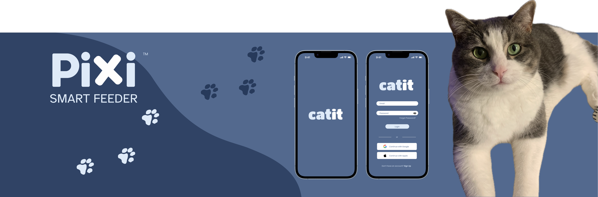
Catit: PIXI Smart Feeder
Redesigning an app-based service to assist cat owners in optimizing their feline’s feeding schedule and customizing appropriate food portions.
Role
UX & Research, UI Design
Client & Industry
Self-initiated; Pet Care Industry


Design Tools
Figma, Photoshop
Platform
iOS
In August 2024, a friend reached out in our group chat and asked if anyone was able to care for his cat for 2 weeks.
I offered to take her in and within the hour, I had a tabby cat sitting in my living room. She came with the standard amenities: a litterbox, an automatic food and water dispenser, and some toys.
The food dispenser, in particular, needed to be connected to my WiFi in order to operate smoothly.
While reviewing the app to set up the dispenser, it wasn’t difficult to notice the plain and outdated designs. It needed an upgrade to a more modernized and cohesive visual design.
Background
What Needs to Change
Visually, the designs are quite plain and outdated. There’s a limited color palette of about 2 main colors, blue and white, and a particular style of drop shadows that has been outdated for some time.
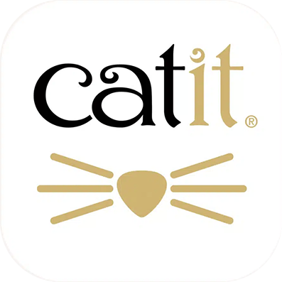
The “Catit” logo is more decorative than the style of the rest of the designs in the app.
The mismatch might appear a bit off-putting to the everyday layperson at worst and completely ignored at best, but as a visual designer, seeing such a decorative font placed amongst the more sans-serif-styled layout was quite jarring.
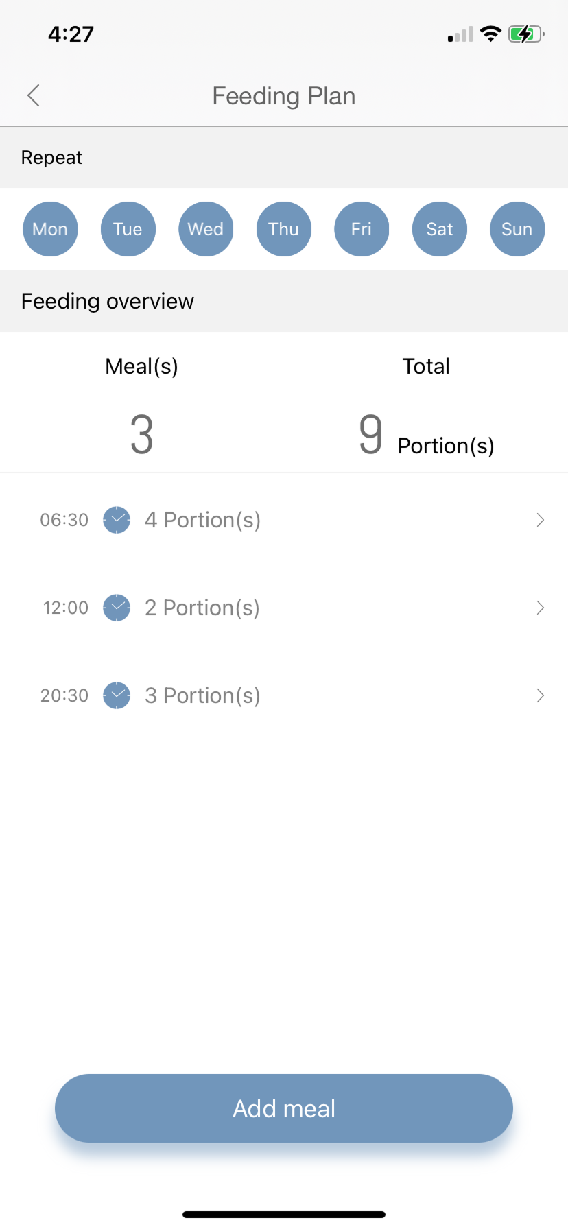
The placement of some text and icons seems inconsistent and without
much intentionality. As designers, it’s our responsibility to ensure that best design practices are achieved.
And finally, after placing some of the color hex codes into the accessibility checker, it turns out that the white and light blue colors are inaccessible when placed together. The accessibility checker then outputted a corrective version instead, which I will use for the new redesigns.
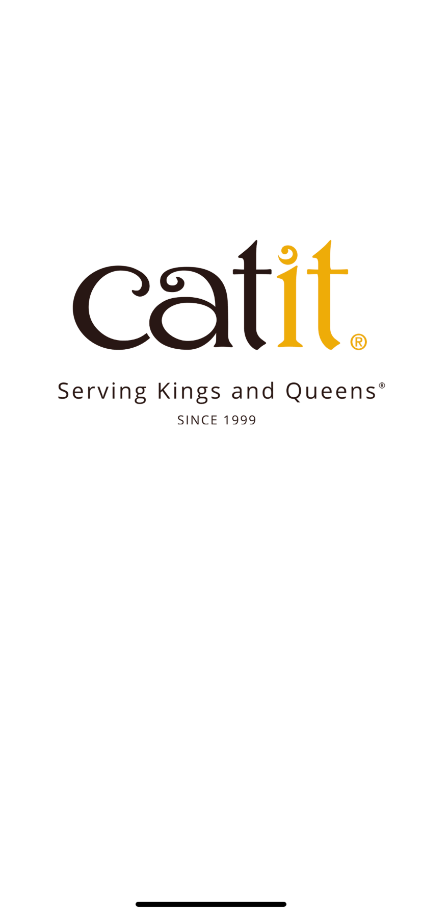
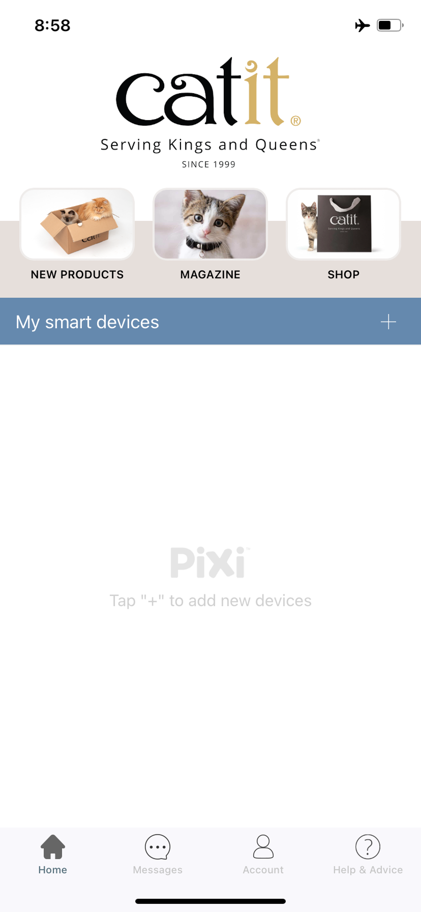
old Catit design

Overall Approach
It’s my goal to achieve an effective, user-friendly, and visually satisfying interactive experience.
The process of redesigning an existing app realistically involves very little complete and total overhaul; therefore, I will use similar parameters of the existing app to determine the redesign.
Using some of the old design's main wireframes as the base, I redesigned them to match current trends and accessibility design criteria.
User Research Approach


Visual Design Approach
Utilizing the current design as the main inspiration made the entire redesign process easier.
As a visual designer, I value the intuitive use of color, especially in scenarios where there is heavy use of white space.
In this scenario with the Smart Feeder app, white space is prominent. To make changes that weren’t so drastic but still effective, I dabbled in the world of blues - particularly the mid and darker tones.
Old Color Scheme
#7A7A7A
#636363
Wireframing Approach
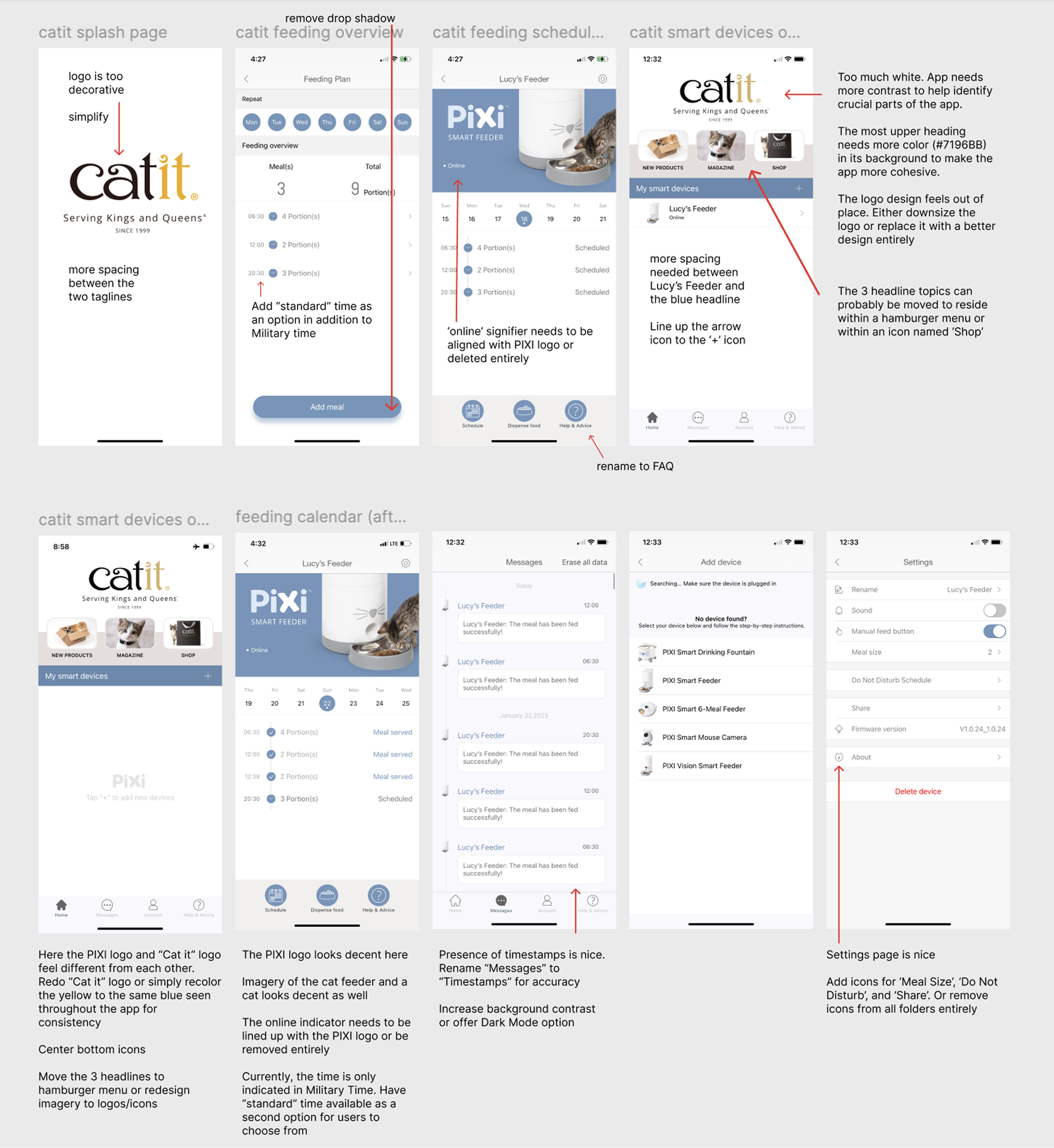
I utilized the Heuristic Analysis to help identify exactly what features needed to be changed and why. To pinpoint potential opportunities to improve or clarify a feature, I used the red arrow and written language to spotlight inconsistencies and showing my intent to improve that particular feature.
After identifying visual and UX challenges, I began to build high-fidelity wireframes and create a functional prototype.
Semi-Flat Icon:
The middle ground between flat and skeuomorphic design.
This is a minimalistic logo, with minimal gradience


#7296BB
#FFFFFF
New Color & Logo Scheme
#53698D
#636363
#DDEAF8
#FFFFFF
Old Logo Color Scheme
#291815
#ECAB09
#DDEAF8
#FFFFFF
New Logo Color Scheme
#53698D
#FFFFFF
#DDEAF8


Cat whiskers and Dog ears are easily the most identifiable animal characteristics one could use to help users understand when a service-leaning product’s purpose is to serve the needs of a pet.
And because this particular app, titled Catit, serves cats and their servants guardians - it’s appropriate to specifically use cat whiskers as the app’s symbol.
Old Catit App Icon
New Catit App Icon


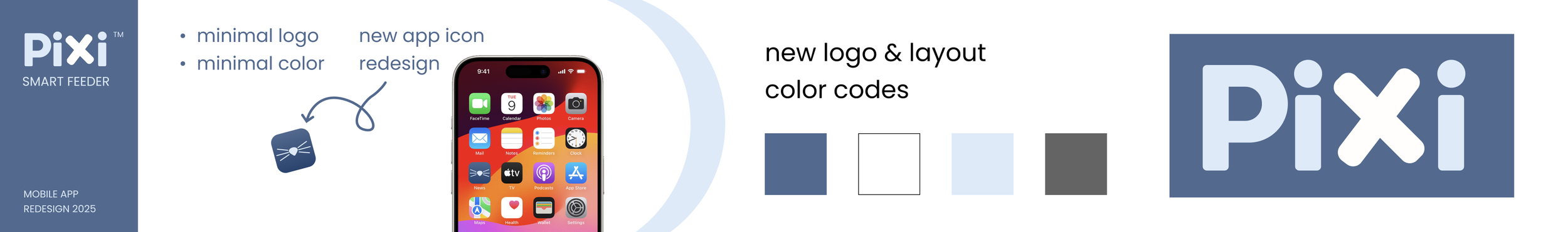
App Icon Design Iteration
The Main Component: Cat Whiskers
Flat Icon:
Solid coloring, minimalistic logo, with no shadows or gradience
In this current direction of minimalistic app designs, it’s imperative that one singular icon is used to encapsulate the content or main objective of the mobile app and that 2-3 colors are the maximum amount.
If more than 3 colors are to be used, the complexity increases and it can prove to be challenging to achieve seamless icon designs but thankfully, it’s not impossible.
