

Hertz Design Challenge (IBM)
Role
Visual Designer
Product Designer
Researcher

Improving the vehicle renting app experience for professionals who frequently travel for work.

Client
IBM Design Challenge, Hertz
Tools
Figma, Photoshop
Areas
Design, Strategy, User Research
Timeline
Jan. 2021
4 hours
Final Designs


Background
The official prompt of the design challenge:
Design a better way for a mid-career professional who occasionally travels for work to find just the right vehicle when using the Hertz mobile app.
For this 4-hour design challenge, I attempted to create a prototype with a strong visual design layout that would keep the user engaged while still providing the intended goal, which is to provide a successful method that allows clients to easily rent their desired vehicle that fits within their budget.
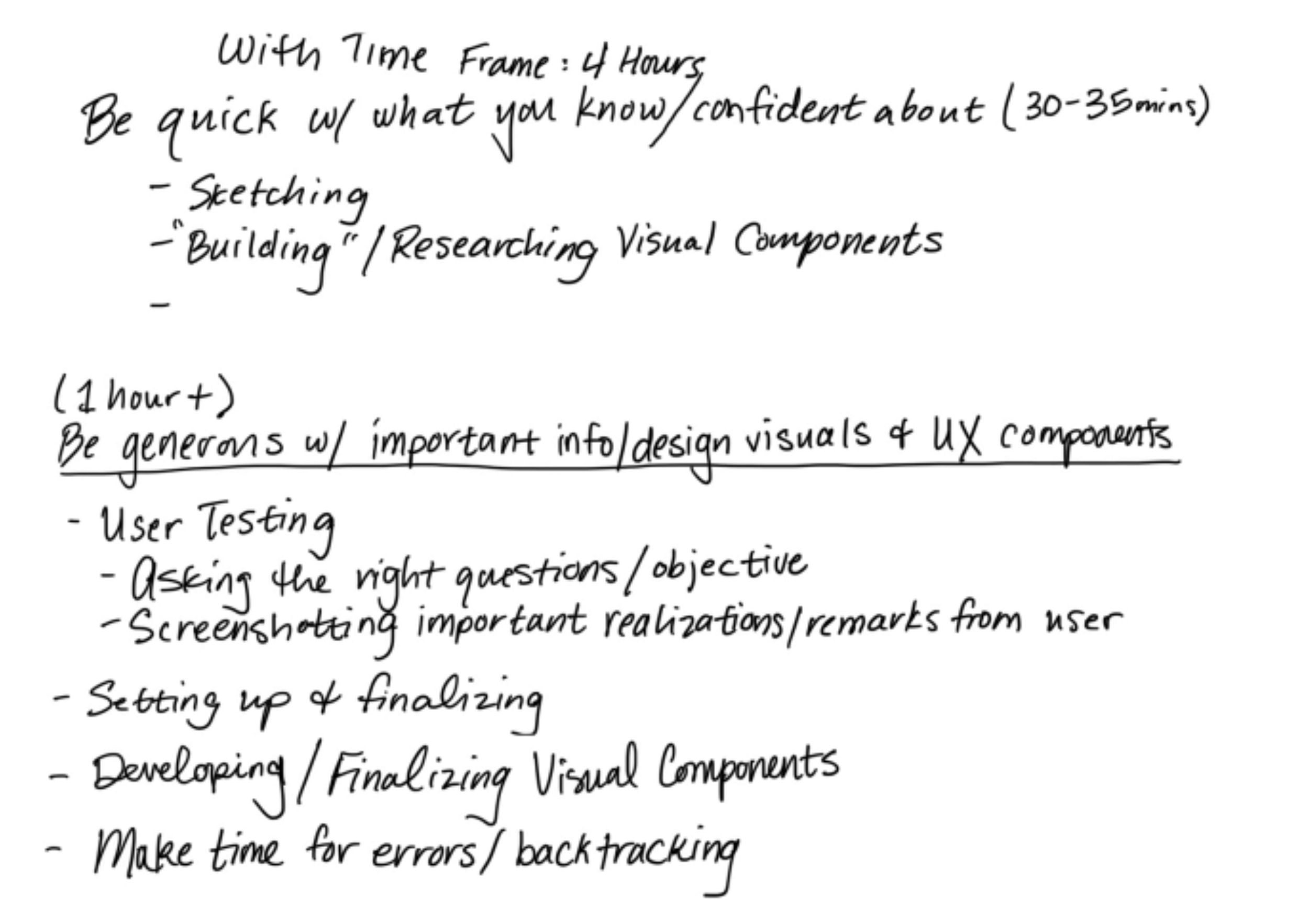
Written notes of my planned out schedule.
What Needs to Change
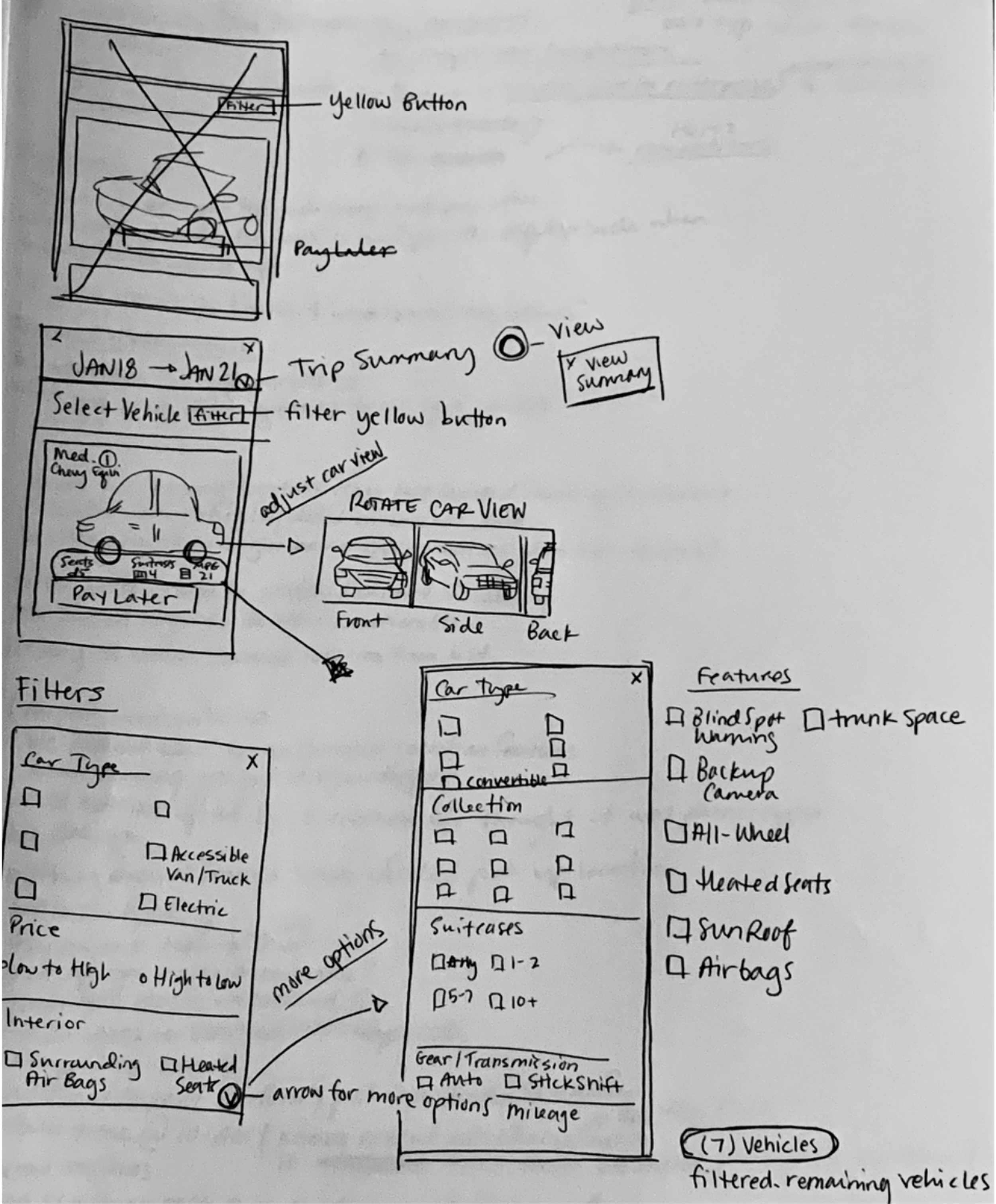
Regarding the original Hertz design, I saw that the colors being used were seemingly used as a second thought or were overly used in some parts. In this case, it’s not about consistency, but about cohesiveness.
Hertz largely uses a black, white, and yellow color scheme, however, the current placement of the colors creates a sense of disarray, thus making the visual appeal feel a bit off and possibly confusing for potential car renters.
Original Hertz Design
User Research Approach
Generally, a designer and researcher would want at least a week to implement thoughtful research, create preliminary sketches, create wireframes, user test.
The main challenge of this particular design project was the 4-hour time crunch. Finalizing everything within 4-hours is certainly challenging but not impossible.
To tackle this, I set up an hour-by-hour schedule by allotting specific times for specific tasks and forcing myself to move on to the next specific task as soon as the timer went off. During this challenge, my mantra became, “It does not need to be perfect, it just needs to make sense.”
30 - 35 mins:
Research and draw preliminary sketches
Build researched visual components
1 hour and 30 mins:
User Testing
Set up clarifying questions for Final User Testing
2 hours:
Develop & Finalize visual components
Make extra time to correct any errors during the process
User Testing & Research as my starting foundation will help me assess how I should approach this project. User Testing & Research is the foundation for everything related to design, even if the particular scope of design is largely visual or illustrative and doesn’t require much User Research/Testing to determine the outcome.
Without proper research, you’re betting on hitting the target or near the target in the dark.
User Testing/Research also helps me to stay anchored and hone in on the problem statement. I tend to focus intensely on minute details, and having a solid starting point gives me clearer methods to develop successful visual designs and UI/UX design solutions.
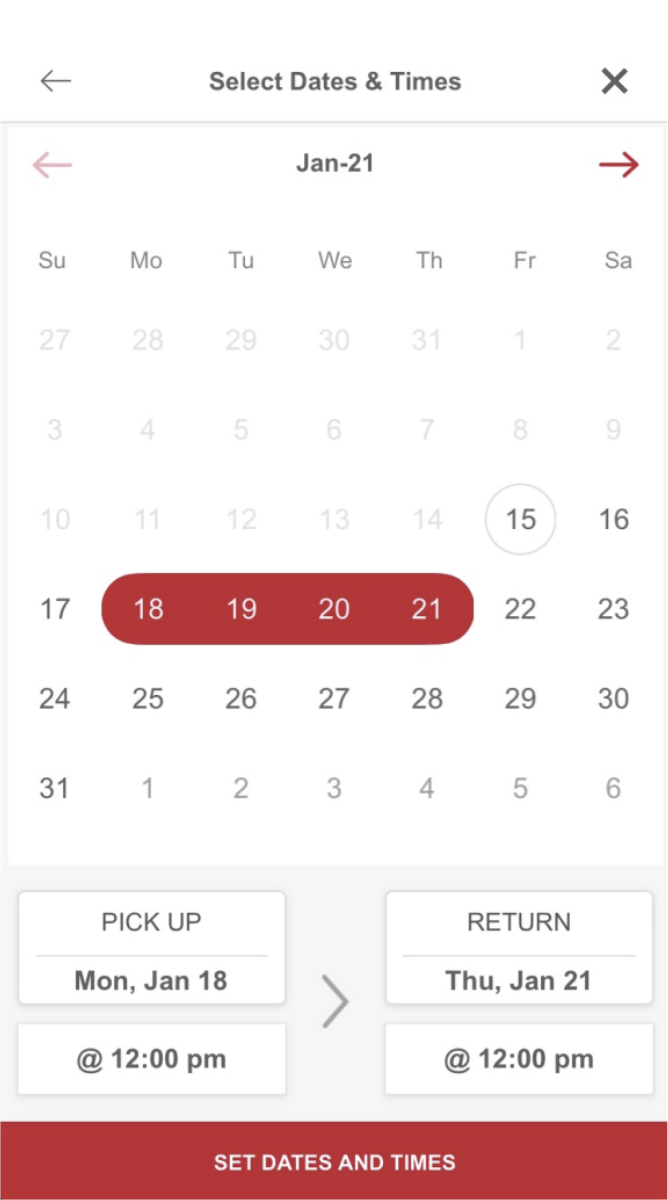
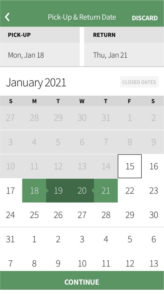
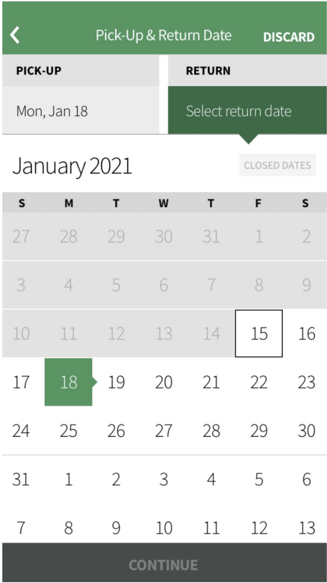
Competitive Analysis

I reviewed two popular car rental companies in competition with Hertz:

Consistencies:
- Can search through different airports
- Search includes filtering
- Accurate relevant search function
Outliers:
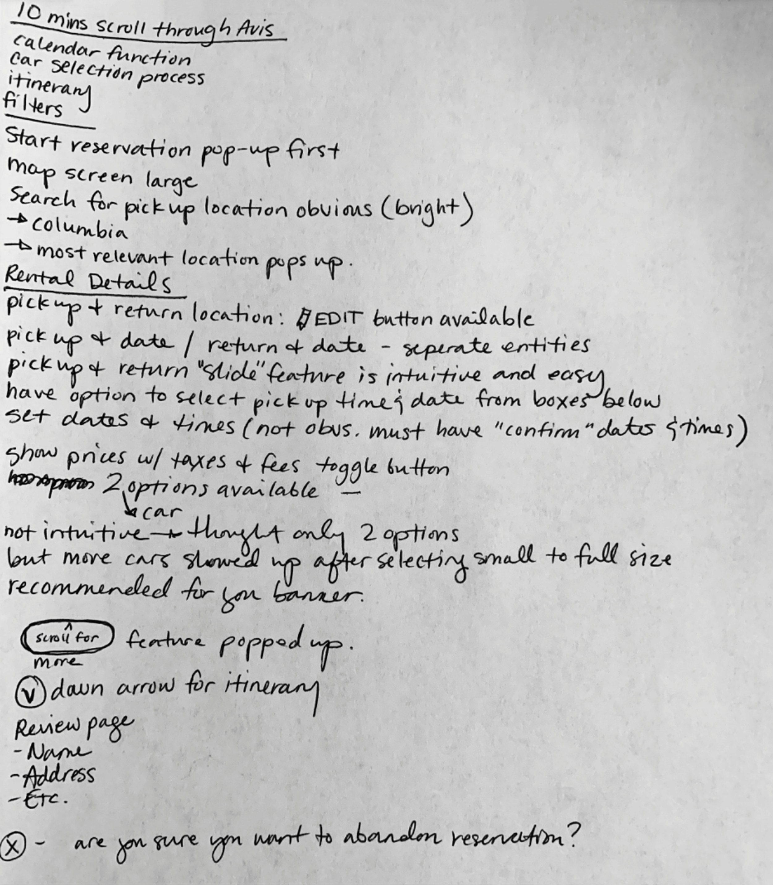
- In AVIS, you can select time and date in the same area you select a calendar date.
- In AVIS, there is a large map screen for easy visual reference
- In Enterprise, you select calendar date before selecting time.
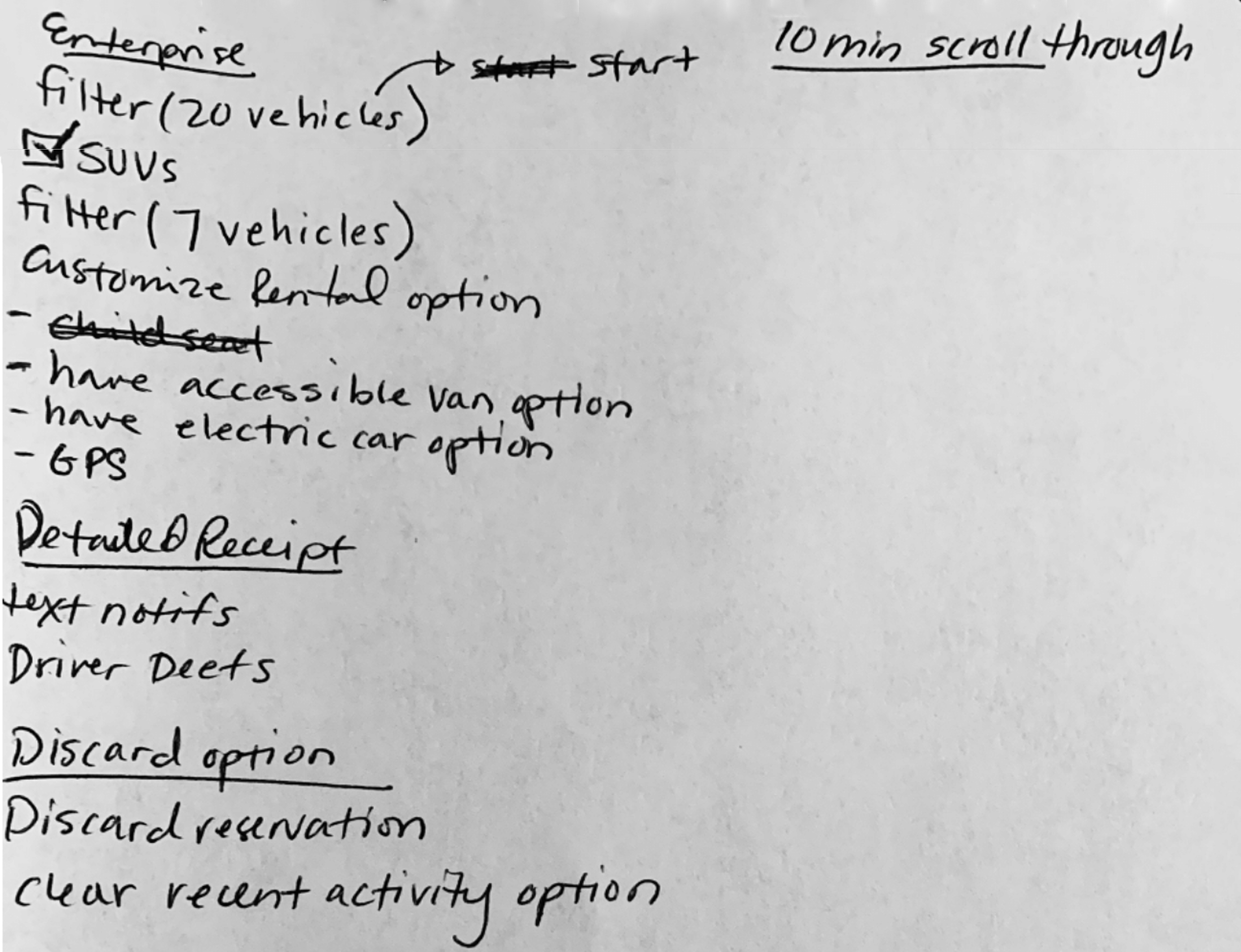
- In Enterprise, you can customize your car rental to accommodate for accessible Vans, Electric cars, and included GPS.

30 - 35 minutes
Research & Preliminary Sketches
1 hour & 30 minutes
User Testing
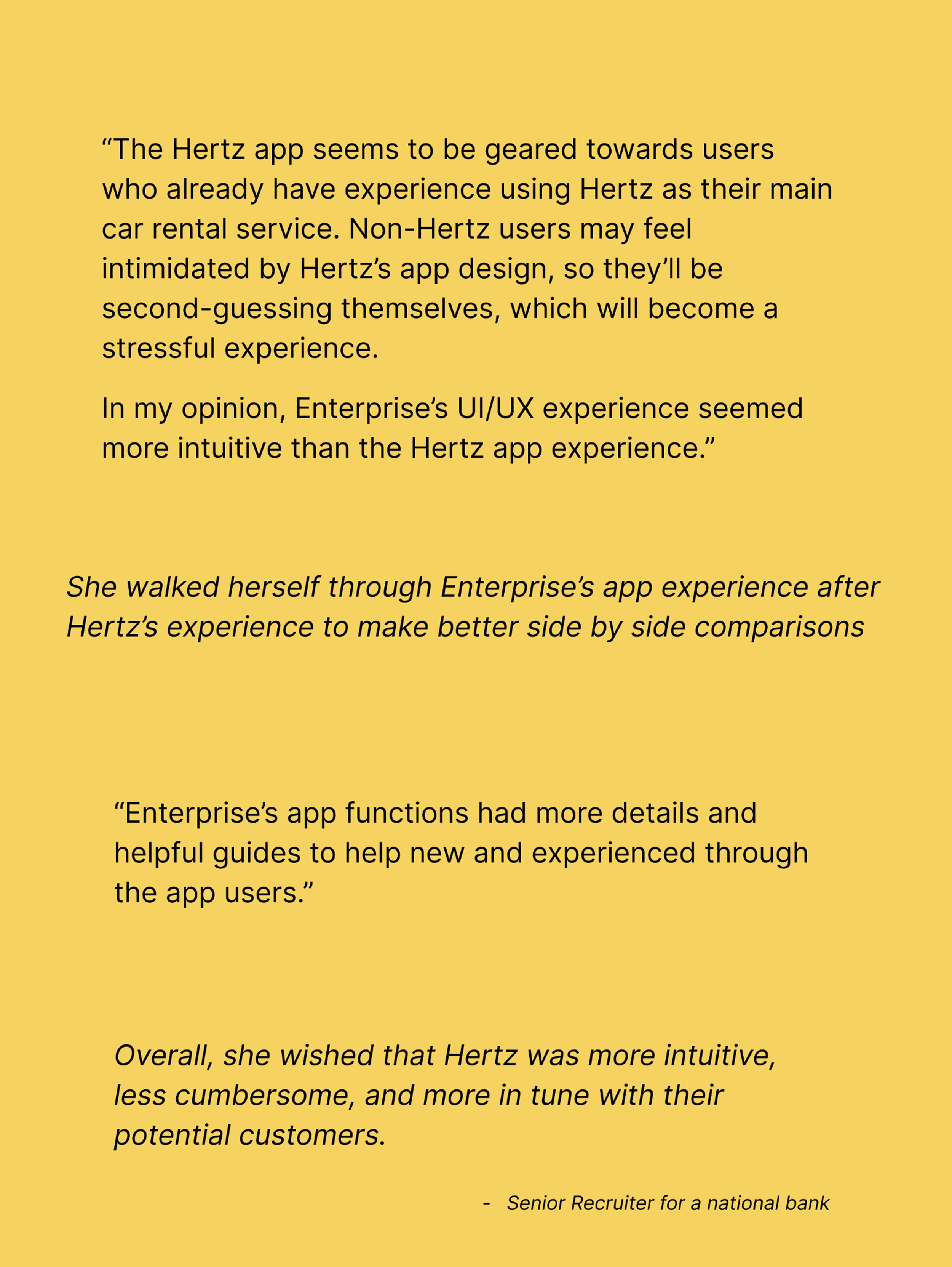
For the User Testing portion, thankfully, I knew of an avid traveler I could reach out to. This individual is also a Senior Recruiter for a national bank. Her work requires her to travel multiple times a week, so she primarily uses Enterprise.
Using her experience, I asked her to use the Hertz app and explain to me her thought process as she gets closer to the checkout line.

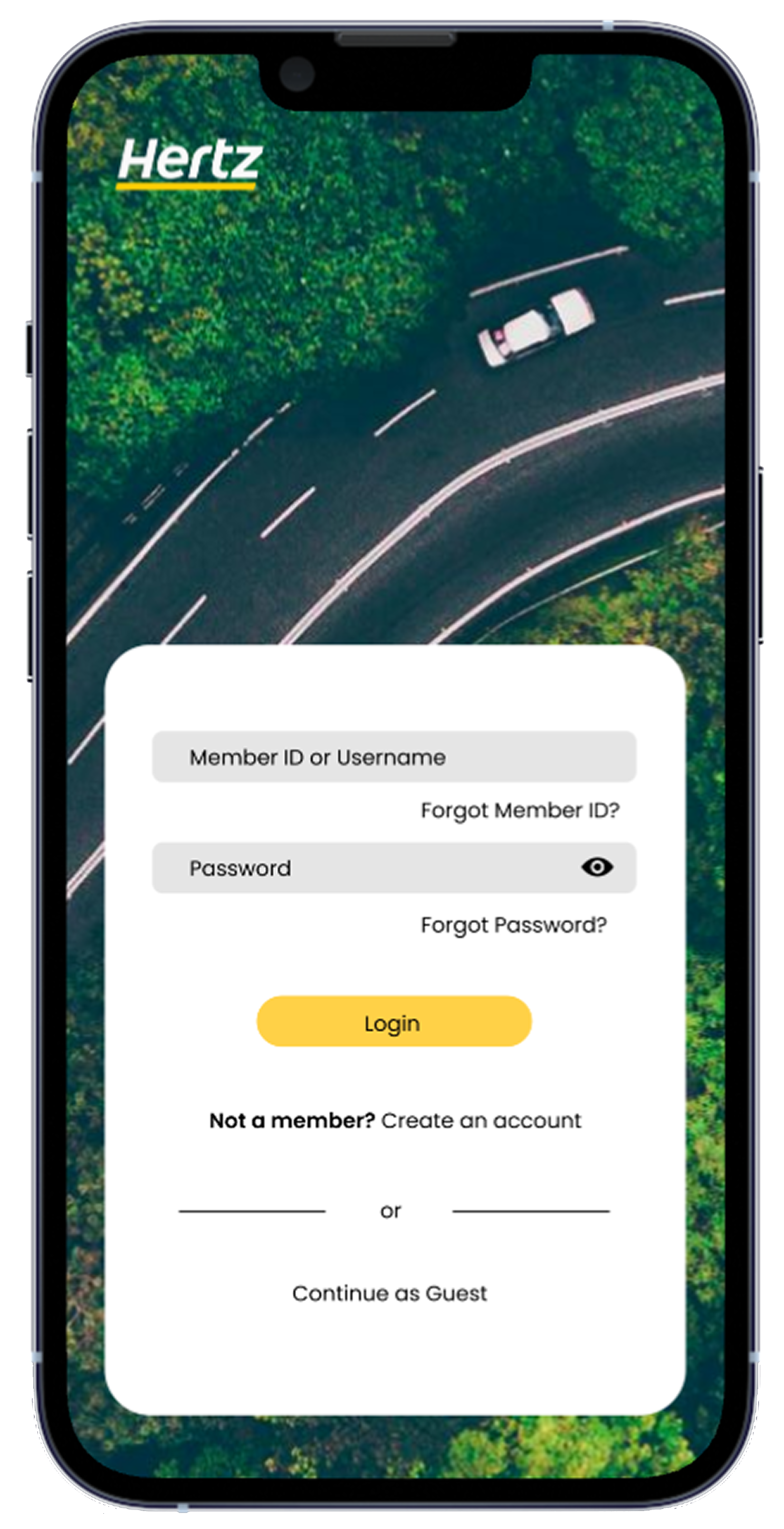
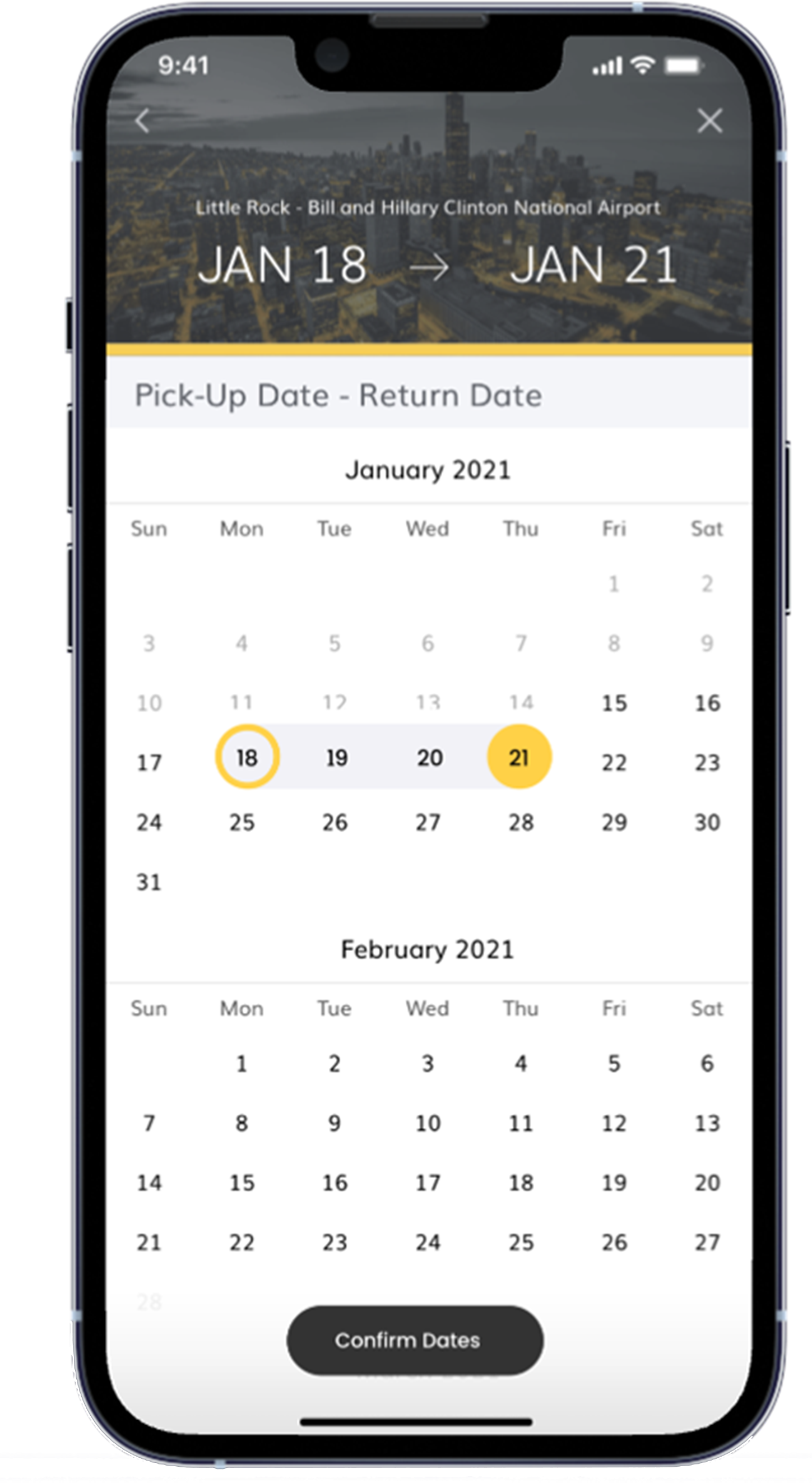
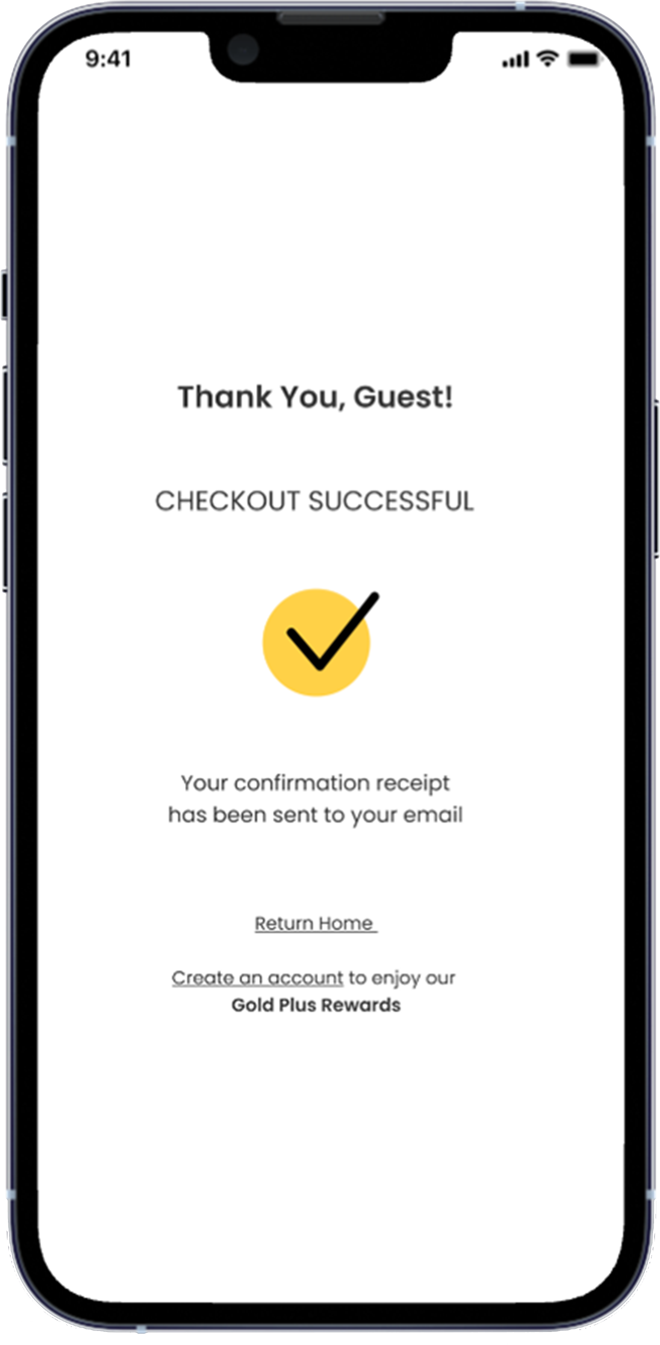
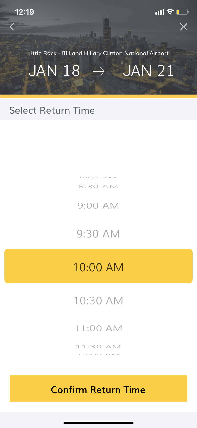
Visual Design
Approach
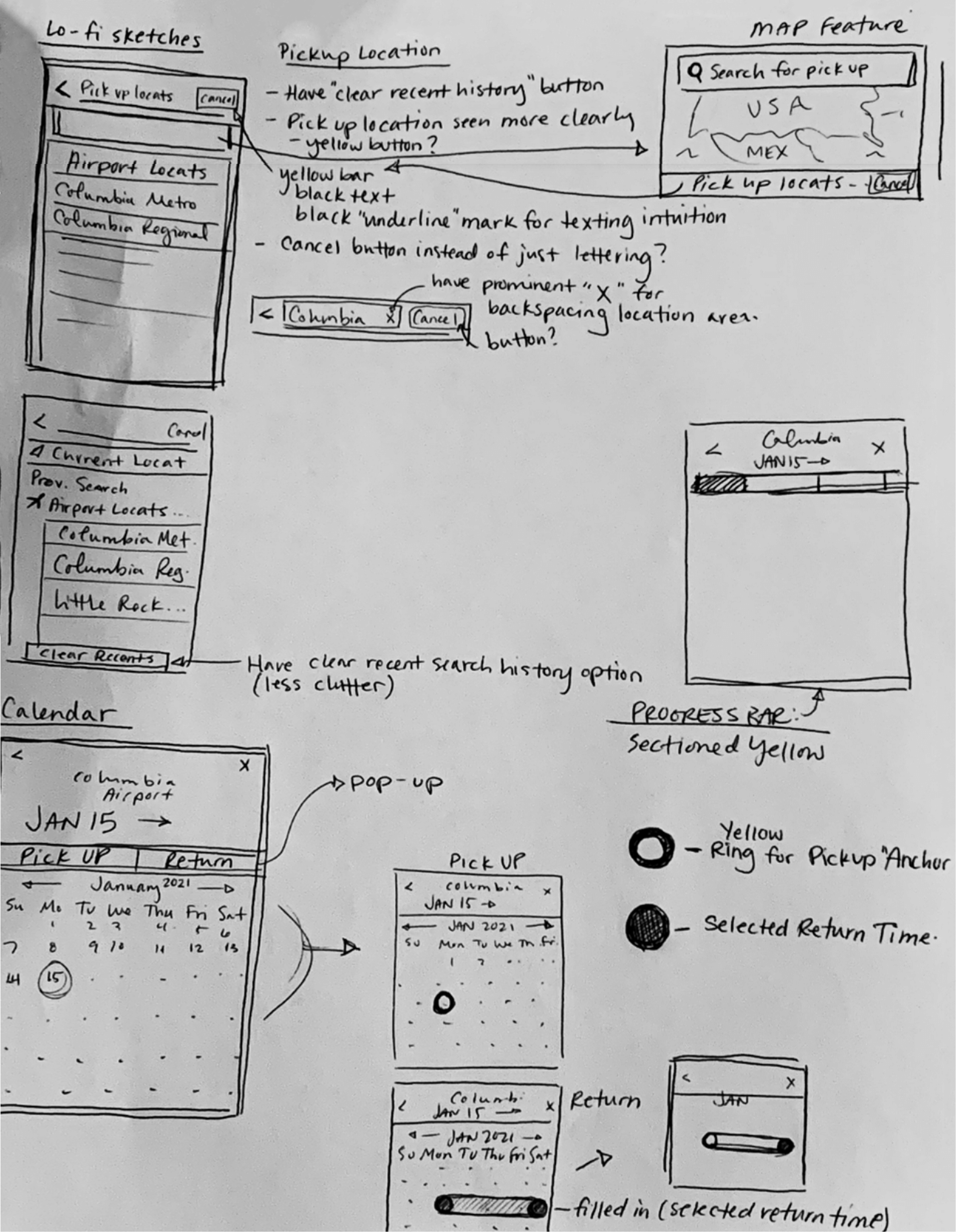
By using my visual design strengths, I utilized yellow as much as possible throughout the app design. Next, I focused on improving legibility and order, and then implementing helpful techniques to help new users find their way through the app as seamlessly as possible.

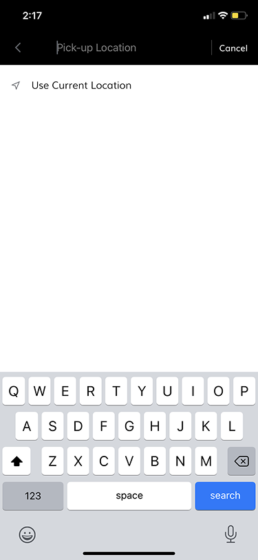
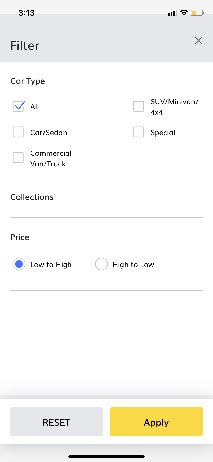
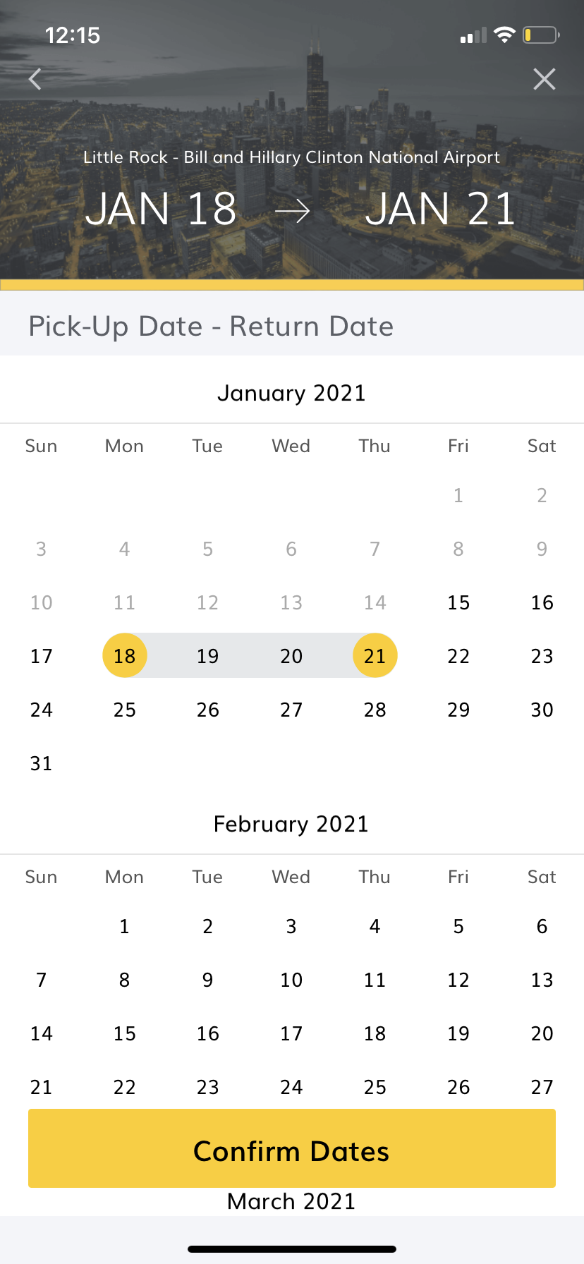
Final Prototype
If I Had More Than 4 Hours
Here’s what else I would have done if I had more than the allotted 4 hours to redesign the Hertz app:
Add more visually engaging designs, such as changing the Airport Header Image to match the location of a user’s destination.
Place simplified iconography throughout.
Made the total amount of USD more prominent.
And last,
Design a progress bar to help the user visualize how much longer they have before reaching the ‘Check Out’ section. Trying to rent a car with your finances can be a delicate and mentally draining process, and adding a progress bar could help users visualize the finish line.
I hypothesize that if users can visualize their progress, they’re able to retain more of their patience and will see the action through rather than quitting the app completely.
However, these hypotheticals are just that, and if I had more time, I would have done extensive user research to confirm if my hypothesis is correct. User Research is imperative to the design process as it allows the Product Designer to create more intuitive, necessary, and cost-effective designs.
During the 4 hours, I’ve come to understand that while visually powerful designs are important, functionality and purpose should be prioritized.